Hindsight Is Always 20/20


https://www.ted.com/talks/r_luke_dubois_insightful_human_portraits_made_from_data
In Hindsight Is Always 20/20, R. Luke DuBois, a composer, and artist well-known for his data influenced art, analyzed every president’s State of the Union address since President George Bush. He used an algorithm to determine how frequently words were used in the speech. Words that were used more frequently where given a higher font weight. Dubois choose the State of the Union address because it is the
“best original source material for elucidating the concerns and anxieties apparent in the national zeitgeist for a given time.”
The algorithm was developed using Jitter, a software suite that DuBois coauthored that deals with the manipulation of matrix data. The data was from the American Presidency Project. The most commonly used words were then arranged into an eye chart specifically the Snellen Chart of Optical acuity. This gives Hindsight is Always 20/20 a practical use as well because people can test their vision by looking at the art piece. The smallest row can be read without glasses from twenty feet away. The project has been presented three different ways: boxed prints, a book, and 43 light boxes. These lightboxes allow the project to be displayed indoors and outdoors. The boxes are 5 feet wide and 1 foot deep. The text is black and the background is white and was graphically designed by Rogerova.com, NYC. This piece was commissioned for the 2008 Democratic Convention and has traveled around to various cities including Denver.
This piece allows the viewer to do more than test their vision. By seeing this piece viewers get a glimpse of what Presidents viewed for America’s future and what was going on during the time of the State of the Union Address. The president’s name is in the smallest font but often viewers will have no difficulty guessing which sign refers to which President. Often a single President’s era is defined by a few key decisions or events. Viewers can also see how America has progressed and changed over time. For example, George Washington’s most used word is “Gentleman” while George Bush’s most used word is “Terror.” Abraham Lincoln’s most used word is “Emancipation,” and Hoover’s most used word is “Unemployment.” Each word in this piece is significant no matter what the size of the word. The pieces draw the viewer in and make them curious about the political parties and life during various time periods. This piece suggests we can only see the significance of various time periods after some time has passed. Sheets for the New York Times states that Luke DuBois
“aims to use technology to expose something about a subject that is not normally visible.”
As the piece suggests hindsight really is twenty-twenty.


Luke DuBois work with Hindsight Is Always 20/20 led him to his next project called A More Perfect Union. For this work, DuBois joined 21 different dating websites and analyzed the most popular words according to zip code creating an alternate census. The project is presented on a series of maps and the names of towns are replaced with the word that is used most often in that location. This word analysis can reveal surprising information about various places. For example, Denver’s most used words on dating sites include light, skiing, and Pepsi. These words make sense for the area because Denver is known for getting 300 days of sunshine a year, good skiing, and a Pepsi company is in Colorado. Each word is significant and creates an identity for the location. Like Hindsight Is Always 20/20 similar data analysis is being used on the most commonly used words. However, this project has a much larger scale than just analyzing the words of Presidents, as this project covers an entire country and individual states. This project is a more accurate representation of the American people then Hindsight Is Always 20/20 because many people were analyzed instead of one person. This project also occurred during 2010 and 2011. It would be interesting to see this project created over a variety of years to see the changes over time. This project also has a different data set instead of speeches this project uses information from dating websites.
https://www.ted.com/talks/nathalie_miebach#t-180543
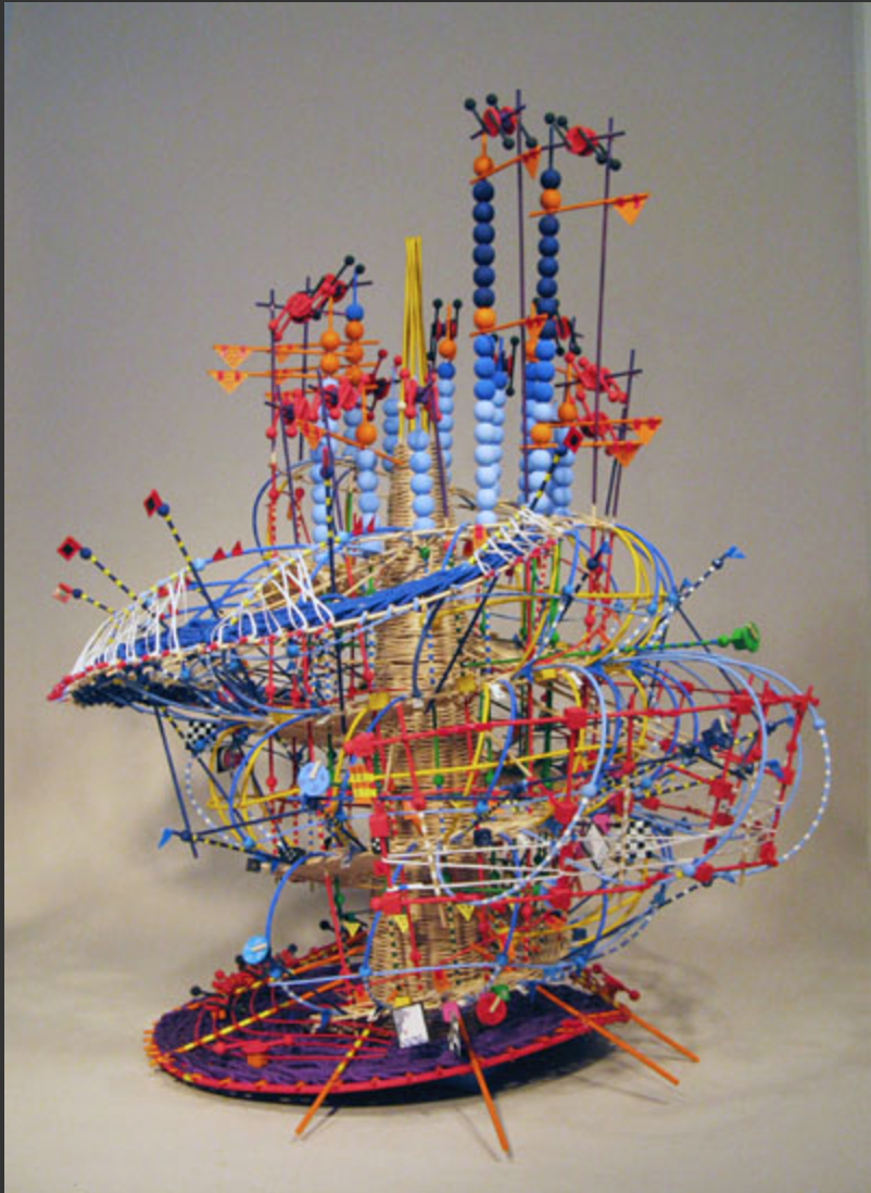

Data can be analyzed from anything, not just from most commonly used words. Artist Nathalie Miebach uses weather data to create sculptures that can also be translated into musical scores. Mieback created a visual and musical representation of Hurricane Noel called Hurricane Noel in 2015. This piece looks a like a bright child’s toy as it is a warped and twisted basket that has various colorful pieces of plastic attached to it. However, each visual element on this sculpture represents a piece of data from Hurricane Noel. This piece can also be read as a score from the barometric, wind, and temperature readings. Mieback’s piece highlights the many ways that data can be interpreted and visualized. Unlike DuBois, her work is not just viewed on a flat piece of paper. She provides new ways that data can be represented as both a sculpture and a song. Various representations of data sets can reveal hidden meanings about the data. Yet like Dubois, her sculptures are not just visually pleasing her work has meaning that is dependent on data. Also similar to Dubois, Mieback collects her own data and uses data that she finds online.
In an increasingly information-dependent world artists are finding meaning in data visualization. Data visualization can be presented in many different ways but provide a new context to present complex data. Both Miebach and DuBois use data in different ways but their works provide new information about the data they started with. Data visualization can often reveal hidden patterns which suggest that data is a great new medium for artists.
Links:
https://www.ted.com/talks/r_luke_dubois_insightful_human_portraits_made_from_data
https://www.nytimes.com/2014/01/12/arts/design/r-luke-dubois-mines-data-to-reveal-art.html
http://thegovlab.org/luke-dubois-portraits-in-data/
https://www.ted.com/talks/nathalie_miebach
http://nathaliemiebach.com/portfolio.html